Saturday, 29 October 2011
Android Fragmentation: It's an Ugly Picture
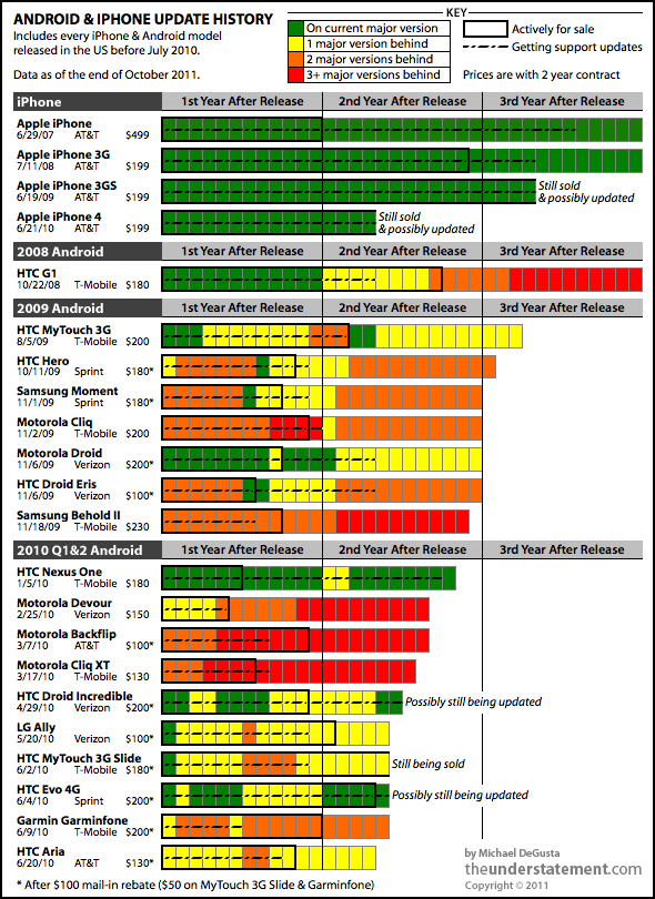
Technically it's not a picture, it's a chart and a great one created by Michael DeGusta at his Tumblr blog: The Understatement. The basic color rules apply here: green is good and red is bad. As you can see from a quick glance at the chart, Android users have a lot more red than iPhone's green :( Check out Michael's analysis for more details.
Subscribe to:
Post Comments (Atom)

No comments:
Post a Comment